|
 |
 |
TOPICS
A. Defining Targets for Attitude Performance
B. Creating a Survey
C. Displaying Survey Results
 |
|||||||||||||||||||||
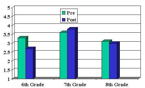
C. Displaying Survey ResultsAfter you conduct an attitudinal assessment, you need to examine the results, and, if appropriate, make changes in your classroom management, instruction, or interactions. In other words, if you are not going to act upon the results, then don't conduct the survey. There are many ways that survey data can be displayed and/or reported. The most common approach is to compile the responses and create charts or graphs that can quickly convey the information. For example, the University of Texas administered Attitude Toward Science Class surveys to over 400 students in 6th, 7th, and 8th grade. Looking strictly at the averages (means), it's difficult to get a picture of whether the attitudes were improving or not. For example, look at #23: "Science is one of my favorite classes."
By displaying the same data in bar charts as illustrated below, it is much easier to see that the attitude of the 7th grades improved over the year, while the 6th and 8th grades became more negative.
Bar chart for displaying survey results. Pie charts, line graphs, scatter plots, and others are valuable methods for displaying survey data.
|
|||||||||||||||||||||
 |
||
Try ThisExperiment with creating graphs and tables using Excel, PowerPoint, or the online program, Create a Graph.
|
Continue
to Assignments This course was developed in partnership between the Pinellas School District and the Florida Center for Instructional Technology at USF. |


