
If you make presentations and want to avoid “Death by PowerPoint,” here’s a collection of unusual nineteenth century illustrations of people, animals, and word balloons that might just be what your presentation needs. They probably won’t be appropriate for most of your presentations, but it’s a great resource to keep in mind when you’re looking for something a bit unusual. Take a moment to see what the collection offers and bookmark the site for future reference.
You’ll find the “Paper People” collection in the Presentations ETC website.
What’s in the “Presentation Paper People” Collection?
The collection includes several hundred illustrations arranged into seven categories. Each illustration is available in both a black-and-white version and a second version that has been toned to look like an old paper doll. In addition to the two styles, each image is available in your choice of five sizes. Each image has a completely transparent background. That means that you can easily place the image into a photo or illustration, or against any color or texture of background you are using.
Here is a sample image from each of the seven categories:
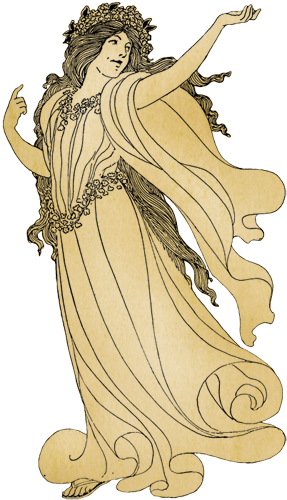
Women
80 women available in black-and-white or antique paper versions
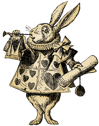
Animals
80 animals available in available in black-and-white or antique paper versions
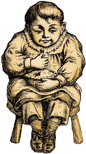
Children
80 children available in available in black-and-white or antique paper versions
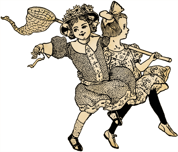
Groups
20 groups available in black-and-white or antique paper versions
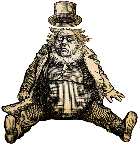
Men
80 men available in black-and-white or antique paper versions

Hands
19 hands available in black-and-white or antique paper versions

Word Balloons
80 word balloons available in black-and-white or antique paper versions
This group also includes thought bubbles, whisper balloons, idea balloons, radio balloons, and miscellaneous note shapes.
What makes this collection special?
Transparency. The most important feature of the collection is that the background of each image is transparent so you can place it over any image and the background image will show through. Even if you just want to place it on a slide with a plain color background it’s important that the image has a transparent background.
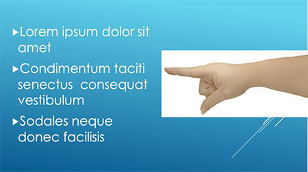
Yuck
Pointing hand without a transparent background
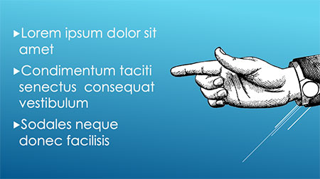
Yay!
Pointing hand with a transparent background
And since the backgrounds are transparent, you can add effects that follow the exact shape of the image. Your presentation program will probably do simple effects like a drop shadow, glow, or reflection. If you want more complex effects, you may need to create the slide in a graphics-editing program like Photoshop.
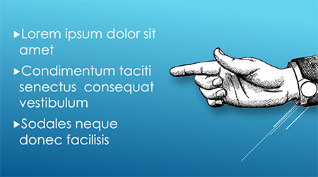
Drop Shadow
Simple drop shadow added in PowerPoint
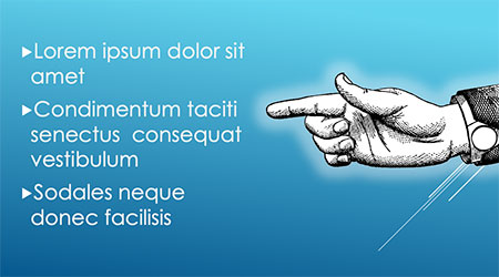
Glow
Simple glow effect added in PowerPoint
The transparency of the images also allows you to animate them over the presentation slide background. The animation of the car over a map of the Tampa Bay region below might be an effective introduction to the history of bridges over Tampa Bay. The animation is jumpy because it’s just a small GIF, not an animation actually running in presentation software such as Keynote or PowerPoint.

Of course one should always keep in mind that the purpose of any animation is to draw attention to the point you are trying to make in your presentation, NOT to create a distraction.
One last note, each of the images in this collection is also available as a higher resolution layered TIFF if you would like to use it for printing purposes or need it exceptionally large in a presentation.
I hope you have fun with these images! I’ve enjoyed dropping them into various presentations I’ve made over the years.
Additional Graphics Posts
- Colorizing ClipArt: Intro to Blending Modes
- Colorizing ClipArt: Using Gradient Maps
- Four Ways To Emphasize the Subject in Instructional Graphics
- Photo or Illustration?
- Using ClipArt ETC for Flyers and Newsletters
- Paper People for Your Preso
- Cutout People for Digital Narratives
- Converting Raster Clipart to Vector
- Signs for the Times: Repurposing ClipArt ETC traffic signs
- 4,000 Drop Caps: When and how to use FCIT's drop cap collection in your documents
- Custom Banners: How to manipulate an image so that it tiles (repeats) seamlessly
Roy Winkelman is a 40+ year veteran teacher of students from every level kindergarten through graduate school. As the former Director of FCIT, he began the Center's focus on providing students with rich content collections from which to build their understanding. When not glued to his keyboard, Dr. Winkelman can usually be found puttering around his tomato garden in Pittsburgh. Questions about this post or suggestions for a future topic? Email me at winkelma@usf.edu. To ensure that your email is not blocked, please do not change the subject line. Thank you!
FCIT Newsletter
Each month FCIT publishes a newsletter with short articles on teaching and learning with technology, using digital content in the classroom, and technology integration. Subscribe today! The subscription form will open in a new window. When you have subscribed, you can close the new window to return to this page.
