FCIT provides over 100,000 copyright-friendly images for students and teachers to use in the classroom. The two largest collections are ClipPix ETC (our stock photography collection) and ClipArt ETC (our collection of illustrations—mostly black and white line drawings). Often when we are exhibiting at EdTech conferences we’ll have teachers stop at our booth, comment on some of the displayed photos that drew them in and then turn their noses up a bit at the black-and-white line drawings, usually saying something along the lines of, “Kids like colorful photos, not old black-and-white drawings.” That’s always bugged me, but when you have thousands of teachers stopping by the booth, there isn’t much time for extended discussion.
But now that I have the time and a whole webpage for the topic, I’d like to explore the differences between the uses of photographs and illustrations in the classroom. They both have their role in instruction. Teachers would do well to choose the type of image that is best suited to the need at hand.
⚠️ ⚠️ ⚠️ BIAS ALERT ⚠️ ⚠️ ⚠️
Since this is my opportunity to answer the teachers who pooh-pooh our black-and-white line drawing collection, I just might have my thumb on the scale when it comes to the value of illustrations in the classroom. 😉
Some General Observations


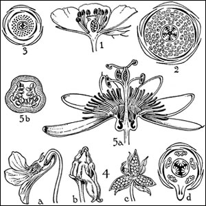
A photo is generally better for revealing the outward appearance of the subject. An illustration is often better for revealing the structure of the subject.


A photo is usually going to show a specific example, whereas an illustration can show a generalized concept. If your purpose is to communicate the idea of a smile, an illustration can do that in a generalized way. A photo of a person smiling will always be a specific person of a particular race, age, and gender. You may have students reacting to the specifics rather than the general concept of the smile that you had intended.


A photo typically shows the subject against a background of some sort. This is helpful if you want, for example, to show the sort of environment that a particular animal inhabits. At other times the subject can get lost in the background. An illustration often shows the subject removed from any background which is helpful if you want the focus to be on the subject only.


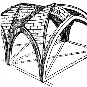
Sometimes illustrations reveal structure in ways a photo never could, for example a cross-section, an x-ray view, a cut-away view, or an exploded view.
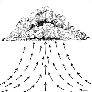
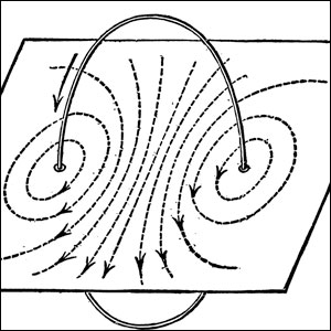
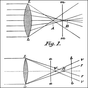
An illustration can also represent air currents, magnetic fields, or other forces that are not directly visible.

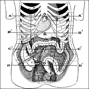

For a variety of reasons, medical or anatomical images are often better presented as illustrations rather than actual photographs.


And, of course, there’s the entire realm of the imagination. How many children’s books are illustrated with photos rather than illustrations?
Finally, illustrations will often reproduce better than photos at small sizes. If, for example, you were replacing selected words in a text with small images, it’s likely that tiny drawings would be easier to “read” than tiny photographs. That holds true for any use of small images—for example, keys or buttons on an assistive device. In general, line drawings will also reproduce better when printed—for example, on a test or worksheet.
Both photos and illustrations have their place in the classroom. But what if you are using one of our black-and-white illustrations and need it to be in color? Well, we have that covered. Read the post “Colorizing ClipArt.”
Giving Photos Their Due
In the interest of fairness, you may also want to read “FCIT Photos as Writing Prompts” or “History in 3D: Using Stereoviews as Primary Sources in Your Classroom.” You can also explore the “Photos of the Month” series for a wide range of suggestions connecting photos to various subject areas.
Additional Graphics Posts
- Colorizing ClipArt: Intro to Blending Modes
- Colorizing ClipArt: Using Gradient Maps
- Four Ways To Emphasize the Subject in Instructional Graphics
- Photo or Illustration?
- Using ClipArt ETC for Flyers and Newsletters
- Paper People for Your Preso
- Cutout People for Digital Narratives
- Converting Raster Clipart to Vector
- Signs for the Times: Repurposing ClipArt ETC traffic signs
- 4,000 Drop Caps: When and how to use FCIT's drop cap collection in your documents
- Custom Banners: How to manipulate an image so that it tiles (repeats) seamlessly
Roy Winkelman is a 40+ year veteran teacher of students from every level kindergarten through graduate school. As the former Director of FCIT, he began the Center's focus on providing students with rich content collections from which to build their understanding. When not glued to his keyboard, Dr. Winkelman can usually be found puttering around his tomato garden in Pittsburgh. Questions about this post or suggestions for a future topic? Email me at winkelma@usf.edu. To ensure that your email is not blocked, please do not change the subject line. Thank you!
FCIT Newsletter
Each month FCIT publishes a newsletter with short articles on teaching and learning with technology, using digital content in the classroom, and technology integration. Subscribe today! The subscription form will open in a new window. When you have subscribed, you can close the new window to return to this page.
