
In October, we started a new series entitled “Getting the Most from your TIM Observation Data.” The purpose of this series is to provide more detailed explanations of the various concepts included in the TIM-O report, including information on how the data are derived and how the tables and charts are constructed. Our overarching goal is to help you leverage the information from TIM Observations so that you can gain a deeper understanding of the technology-related strengths and needs of your teachers, which will allow you to more effectively target their professional development. As a reminder, the concepts included in the TIM-O Report are: Extensity, Flexibility, Level Prevalence, Highest Levels Observed, and Characteristic Dominance. The first post in our series covered the topic of Extensity. This month, our topic is Highest Levels Observed.
Highest Levels Observed
Each lesson observation conducted with the TIM-O will include a TIM level rating (Entry, Adoption, Adaptation, Infusion, or Transformation) for each of the five characteristics of the learning environment (Active, Collaborative, Constructive, Authentic, and Goal-Directed). While it is possible that more than one characteristic is evaluated as being at the same TIM level, an individual level will be reported for each characteristic. Of these five levels reported for each observation, the one that is at the highest level on the TIM, or the one furthest to the right-hand side of the matrix, is then recorded as the highest level for that observation.
To help illustrate the differences between the concepts found in the TIM-O Report, we will use the same dataset and individual teacher examples across our series of posts. The first teacher we looked at in our last post was Mr. Ramirez. Here are the data from three lesson observations conducted in his classroom during the selected time period:
| Observation 1 | Observation 2 | Observation 3 | |
| Active | Adoption | Adoption | Adoption |
| Collaborative | Adoption | Adaptation | Adaptation |
| Constructive | Adoption | Adoption | Adaptation |
| Authentic | Adaptation | Adaptation | Infusion |
| Goal-Directed | Adoption | Adoption | Adoption |
| Highest Level Observed | Adaptation | Adaptation | Infusion |
Here we can see that Observation 1 and Observation 2 resulted in ratings of either Adoption or Adaptation for each of the characteristics, and thus Adaptation was the highest level observed for both of these observations. In Observation 3, the Authentic characteristic was rated at the Infusion level, and thus that was the value for highest level observed for this observation. These are the three values (Adaptation, Adaptation, Infusion) that will then be included in the overall distribution of Highest Levels Observed for the group of teachers and time period that you select.
The second teacher we looked at in the last post was Ms. Jones. Here are the data from three observations in her classroom:
| Observation 1 | Observation 2 | Observation 3 | |
| Active | Entry | Adoption | Adoption |
| Collaborative | Entry | Entry | Entry |
| Constructive | Entry | Adoption | Adoption |
| Authentic | Entry | Entry | Adoption |
| Goal-Directed | Entry | Entry | Adoption |
| Highest Level Observed | Entry | Adoption | Adoption |
For Ms. Jones, the highest level from Observation 1 was Entry, followed by Adoption for Observations 2 and 3. Thus the three values to be included in the overall dataset for Highest Levels Observed are: Entry, Adoption, and Adoption.
As introduced in our previous post, the Report Tool within the TIM Tools suite offers a rich set of analyses that will give you different views of the data. These various approaches to looking at your data can help ensure that you are able to answer the questions that are important to your school or district. Within the Report Tool you select your desired parameters, such as date range and teacher group, and then tables and graphs are generated to help you interpret your data. One of these graphs is the distribution of Highest Levels Observed. This graph is based on the values for highest level observed for each observation in the dataset, which most likely includes multiple observations per teacher. In our example, Mr. Ramirez and Ms. Jones each have three observations that were included in this dataset.
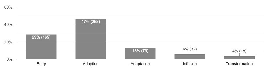
The data depicted in this graph show us that across all of the observations conducted during the selected time period, Adoption was most often seen as the highest level observed, as seen in 47% of the lesson observations. This was followed by Entry as the highest level seen in 29% of the observations and Adaptation as the highest level in 13% of the observations. Infusion and Transformation were the highest levels observed in 6% and 4% of the lesson observations, respectively.
A key piece of information this chart provides is an indication of how common it is for each level to appear as the highest level seen in an observation. Because it provides a distribution of highest levels, this chart combines information about the range of observations with information about the typicality of observed levels. When viewed along side the other interpretive concepts, the graph of Highest Levels Observed can give you a more complete picture of what is typically occurring in classrooms in your school or district with regard to levels of technology integration.
Highest Levels Observed and Extensity
So, you might be thinking, “How is Highest Levels Observed different from the Extensity concept you talked about in the last post?” Well, they are very similar. However, the difference is this: Highest Levels Observed includes each observation as a separate data point, while Extensity groups observations by teacher, with one data point per teacher. Therefore, these concepts answer slightly different questions. Highest Levels Observed answers the question “What is the highest level reached in each observation?” while Extensity answers the question “What is the highest TIM level each teacher has reached?”
Remember that Extensity tells us the highest level that was seen in a lesson across all characteristics and observations for each teacher during the selected time period. This level may have only been observed once, but it give us an indication of the highest TIM level that particular teacher has demonstrated. It does not tell us how often that level occurs as the highest level observed.
When we looked at the data from the three observations in Mr. Ramirez’s classroom, we saw that the highest level observed was Adaptation for Observations 1 and 2, and Infusion for Observation 3. The Extensity value for Mr. Ramirez for this time period was Infusion, and this is the data point that was included in the group distribution for Extensity. This tells us the highest level reached, but doesn’t tell us how often that happened across multiple observations. In the group distribution for Highest Levels Observed, Mr. Ramirez had three values included: Adaptation, Adaptation, and Infusion. Extensity thus tells us that Mr. Ramirez has reached Infusion as the single highest level for any characteristic observed. Highest Levels Observed tells us that observations in Mr. Ramirez’s classroom most often had Adaptation as the highest level observed.
When viewing and interpreting observation data such as these, there are several key points to keep in mind. First is the importance of conducting multiple observations for each teacher, so that you can be more confident that you have a representative view of the teacher’s range of capabilities when teaching with technology. Second, is that concepts such as the Highest Levels Observed and Extensity will help us describe what was observed in a lesson or lessons, but they are not necessarily reflective of a teacher’s full range of capabilities. Finally, we want to stress the importance of matching the pedagogical strategy to the curriculum and student needs. While a teacher may have shown that he or she is capable of delivering a lesson at the Infusion level, in some cases it may be more appropriate to deliver a lesson at the Entry or Adoption level. It is the appropriate match of pedagogy to instructional needs that is the key to sound technology integration. We will address this topic in the next installment in this series!
In This Series
- Extensity: A Teacher’s Highest Integration Level
- Highest Levels Observed: The High Watermark for an Observation
- Flexibility: A Teacher’s Range of Technology Integration Levels
- Level Prevalence: A Snapshot of Typical Teacher Classroom Technology Use
- Characteristic Dominance: A Key to Targeting Professional Development
Christine Harmes is a consultant on research, measurement, and evaluation, and an ICF-certified coach. Her research interests focus on improving teacher use of technology, computer-based testing and usability. At the Florida Center for Instructional Technology at the University of South Florida, Dr. Harmes focuses on research and tool development related to technology integration.