
“Teachers are the toughest students.”
Everyone who has ever conducted professional development has muttered some variation of that quote at one time or another. It’s no surprise that a classroom of teachers is a tough audience. They spend their days making sure that their own instruction meets the needs of all their students. They know their students’ needs. They individualize instruction. They make learning as engaging and relevant as possible…. AND they expect nothing less when they are the students themselves.
It’s no secret that PD often falls short of teacher expectations. All of us have conducted sessions that included a few teachers who tuned out because they already know the topic. It’s always frustrating for a trainer to read the evaluations of a single PD session and see some comments saying that the session was too basic and other comments that it was too advanced.
Wouldn’t it be great if we had a quick way of viewing our district’s PD needs and we could identify teachers who would get the most out of each type of training we offered? The TUPS Quadrant Graph within TIM Tools does just that.
How does that work?
Once your teachers have taken the Technology Uses and Perceptions Survey (TUPS), your TIM Tools instance will have tons of useful data that can be used to inform technology purchase decisions, to collect baseline data for special initiatives, and facilitate coaching. But in this post, we are looking only at how the Quadrant Analysis results can focus your PD efforts and ensure that your teachers are receiving exactly the types of PD that they need. (And actually want!)
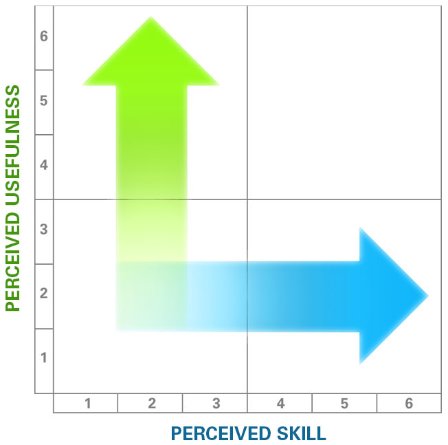
Perceived Usefulness and Skill Level
The TUPS gives you a perceived usefulness and skill level for each of 32 technologies. We can chart the usefulness against skill level as shown above.
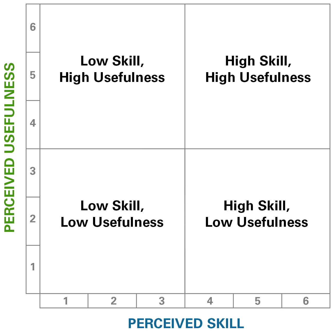
Creating Four Quadrants
Once usefulness is plotted against skills, we can think of four quadrants as indicated above.
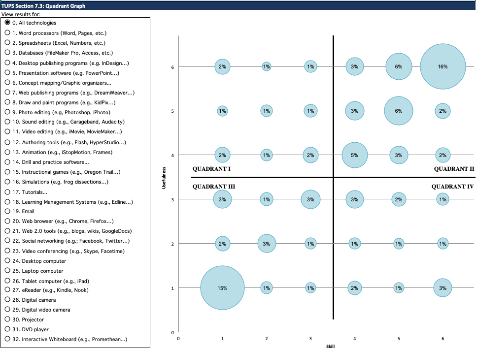
Overall Graph
When you look at the overall technology graph, you’ll probably see a pretty scattered result, but that’s OK because we usually present professional development sessions on very specific topics, rather than a general session on technology. You’ll notice that radio buttons for 32 different technology categories are listed down the left side of the graphic. Clicking through these views will give a district great insight into PD needs. The graph for each technology will show a different mix of perceived usefulness and teacher skill level.
High Value / Low Skill Is a Very Good Place To Start
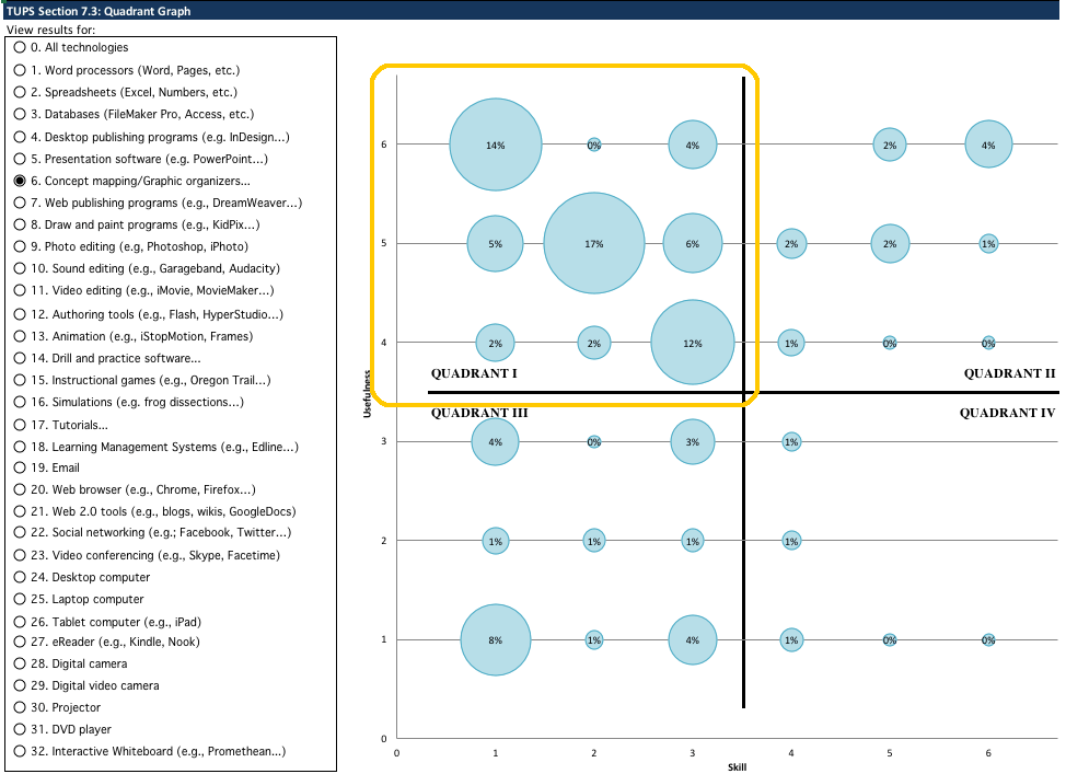
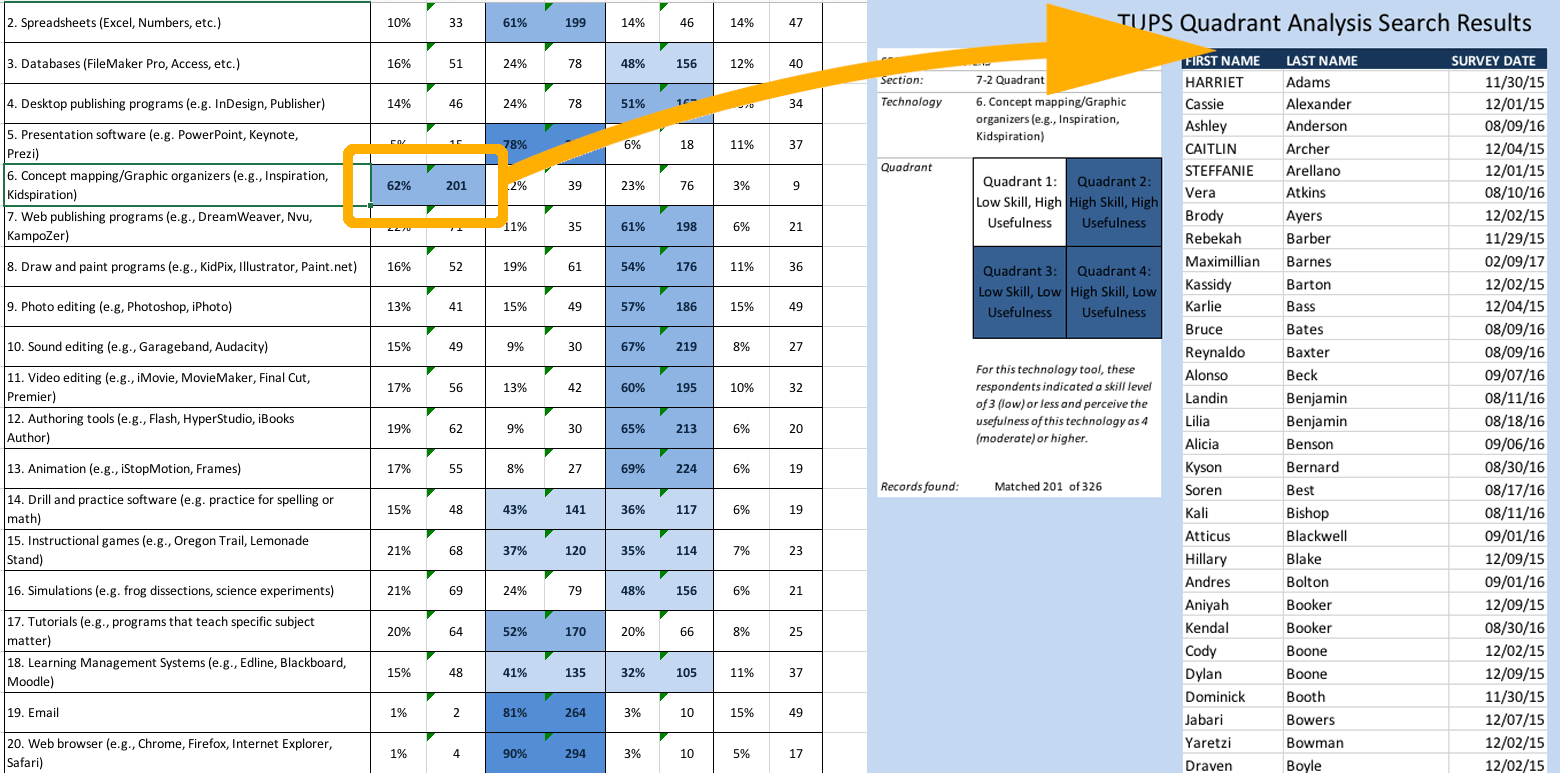
When you see many teachers falling in the High Value / Low Skill quadrant, you’ll know that there’s a need to increase the skill level of teachers for that technology. Some districts refer to this quadrant as “low-hanging fruit” since this type of training is not only needed, but is desired by the teachers who indicated that they think it’s a very useful topic. In this example, 62% of the teachers indicated that they think concept mapping is very useful in the classroom, but consider their own skills to be low.
Low Value / High Skill Indicates a Need for Integration Training
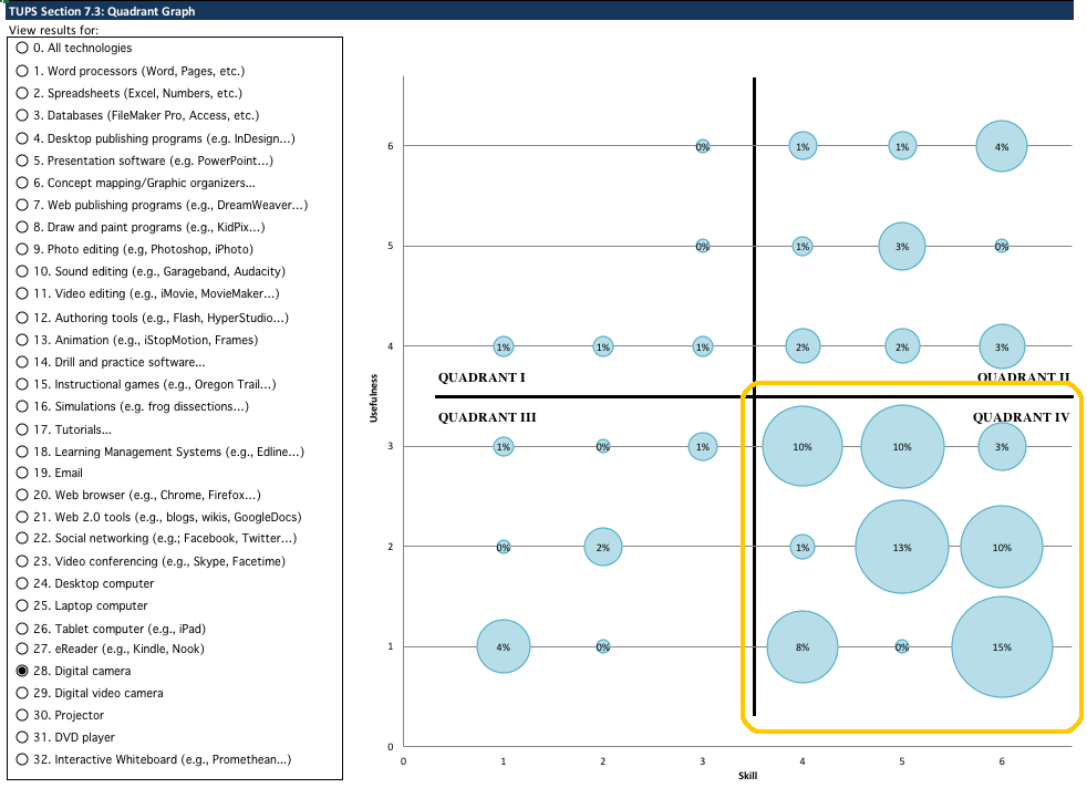
When a technology displays this pattern, teachers consider themselves skilled, but don’t think it’s very useful in the classroom. This indicates a need for PD topics regarding the integration of that specific technology in the classroom rather than training on the technology itself. In this example, 71% of faculty can use a digital camera themselves, but don’t think that it’s very useful in the classroom. These teachers would benefit from sessions like “Twenty ways to integrate digital photography into your curriculum.”
Low Value / Low Skill Quadrant
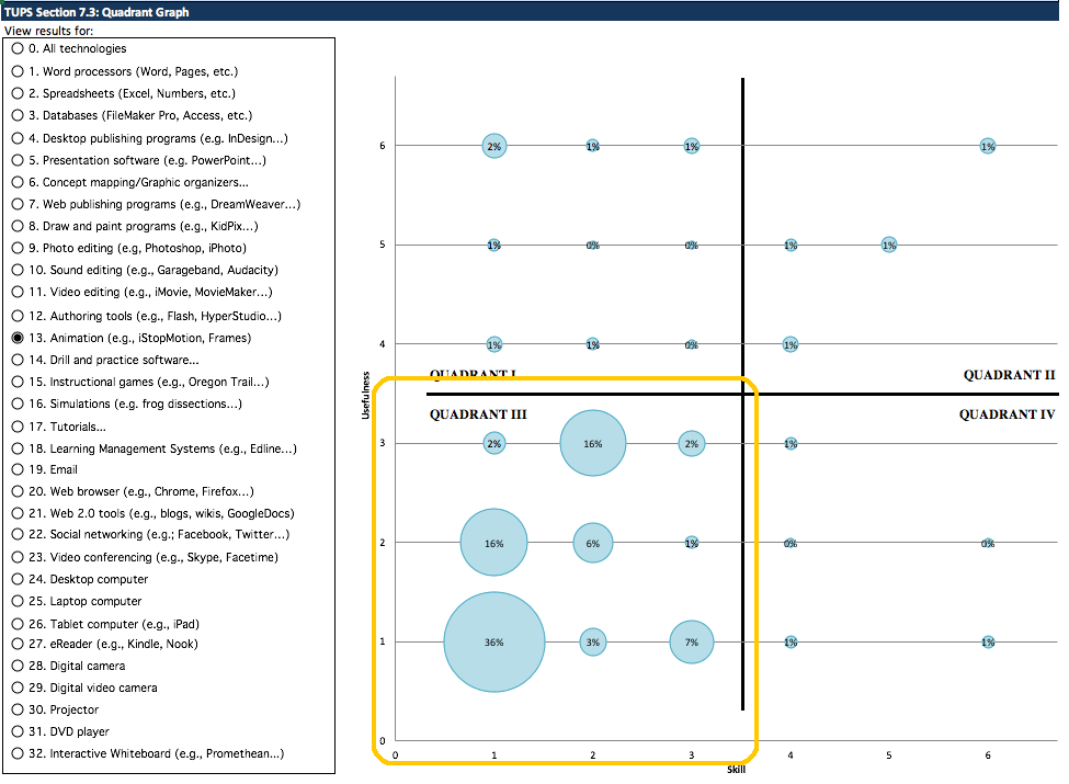
At least you’ll know which topics are going to present a challenge. For technologies that fall predominately into this quadrant, you’ll need to present BOTH the usefulness of the technology and the nuts-and-bolts of operating it. The majority of teachers represented in the graph above consider animation software to have low usefulness in the classroom and they don’t think they are skilled in this technology. In cases like this, a presenter will need to build a strong case for the usefulness of the technology in addition to teaching the nuts-and-bolts of using the software.
But wait! There’s more!
It’s not enough just to know that, for example, 62% of your teachers have low concept mapping skills but think it would be really useful in the classroom. The other 38% aren’t going to want to sit through a concept mapping training. To find out exactly which teachers are in that 62% who would benefit from concept mapping training, move to the Quadrant Table and click on the percentage number there. A list of names of teachers will be generated.
To learn more about the TUPS, please visit our TUPS overview page. For technical information about the TUPS, visit the TUPS chapter of the TIM Tools Admin Guide. You can also email us at TIM@FCIT.US.
Index of TUPS Articles
- Using TUPS Collection Frameworks
- How often should we administer the TUPS?
- Using the TUPS to Target Professional Development
- Nail Your Next Tech PD with the Quadrant Graph
- Working with TUPS Data: The First Read-Through
- Using TUPS Data: Individual Items
- TUPS and Excel
- Find the Coaches Hiding in Your TUPS Data
Roy Winkelman is a 40+ year veteran teacher of students from every level kindergarten through graduate school. As the former Director of FCIT, he began the Center's focus on providing students with rich content collections from which to build their understanding. When not glued to his keyboard, Dr. Winkelman can usually be found puttering around his tomato garden in Pittsburgh.
Want To Know More?
Schedule a personal walk-through of the TIM Tools for yourself or your staff. See how this flexible set of technology integration tools will meet your school or district's specific needs.