
The Technology Uses and Perceptions Survey (TUPS) has many uses—technology planning, grant evaluation, purchasing decisions, etc.— but it’s most commonly used to identify professional development needs. When TUPS data is loaded into the TUPS Data Analysis Template, many useful graphs and charts are generated.
The Quadrant Graph in particular will quickly highlight which technologies large groups of teachers think would be useful in their teaching although their own skill levels are low. Districts often refer to this combination as “low-hanging fruit” since PD for these particular technologies is not only needed, but it’s something that the actually teachers desire. These high-usefulness/low-skill topics are often the starting point for scheduling effective PD sessions.
I was recently working with a new TIM Tools district to interpret their TUPS results and was surprised to find that the quadrant graph did not identify any particular technology that a large number of teachers had indicated as high-value/low-skill. There were a few high-value/low-skill teachers for each of the individual technologies, but no gaping holes that would indicate a widespread need for any particular topic. The overall high skill level among the teachers was even more impressive considering that the district I was working with had a one-person EdTech department.
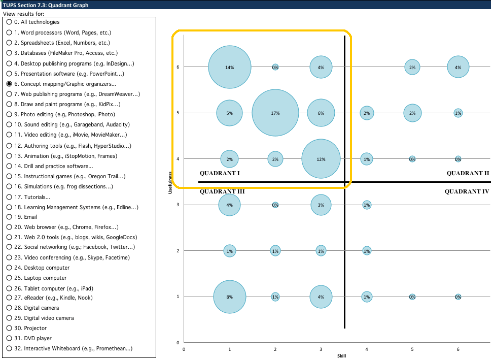
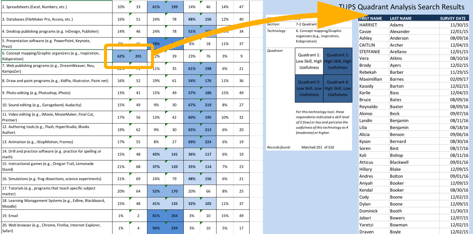
Importing your TUPS data into the TUPS Data Analysis Template will generate many useful charts and graphs. The quadrant graph (above) displays teacher responses to both their perceived usefulness of the technology and their actual skill level of the same technology. For the district shown above, a very large percentage of teachers indicated that they thought concept mapping was a valuable technology for their subject area, but that their own skills were low.
Filling in the scattered gaps
My suggestion to the district with no widespread need for any particular PD was to mine the TUPS data download more thoroughly using Excel directly. Doing so would allow the district to fill in the small PD gaps here and there within the faculty.
One way to use the findings is simply to identify “experts” who had reported high skill levels for particular technologies at each school. With this information made public to the principal and teachers at each school, a teacher who needed help with a particular topic could consult the list and know which colleague to turn to. I’ve seen this system of “tech buddies” or “tech gurus” work very effectively in some districts. It reduces strain on central EdTech resources and, since the tech buddies are immediately accessible colleagues, teachers can quickly get help with their technology use.
Additionally, a closer examination of the data could kickstart the district’s implementation of the TIM-C Coaching Tool. For each of the 32 technologies included in the TUPS, lists of potential coaches can be generated.
Columns of your TUPS download spreadsheet relevant to coaching
Teacher information:
F: Username
G: Last Name
H: First Name
L: School Assignment
W: Subjects
X: Other Subjects
Y: Grades
Z: Other Grades
Teacher’s ability to coach:
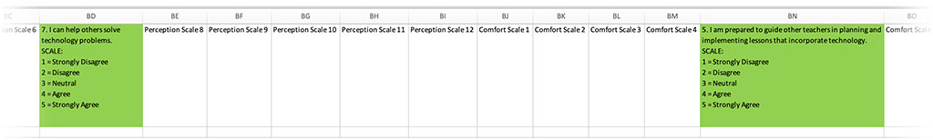
BD: Can help others solve tech problems
BN: Prepared to guide other teachers in planning and implementing lessons
For each of 32 technologies:
CK–DP: Frequency of use by teacher
DQ–EV: Frequency of use by teacher’s students
EW–GB: Teacher’s reported skill level
GC–HH: Teacher’s perceived usefulness of the tech
In a TUPS data download, you will find eight columns related to the teacher. (See sidebar.) Two columns are related to the teacher’s ability to help others solve tech problems and guide other teachers in planning and implementing lessons that incorporate technology. Further, for each of the 32 technologies, you can access 1) frequency of use by the teacher, 2) frequency of use by the teacher’s students, 3) the teacher’s reported skill level, and 4) the teacher’s perceived usefulness of the technology.
By sorting and filtering in Excel, you can easily generate lists of potential coaches using any of the available criteria. You’d want to start by filtering for teachers with high or very high skill levels AND the ability to help others. You might consider it important to also check for frequency of use of the technology by the teacher or students. You could also take into consideration whether the teacher considers the technology to be useful. Other options would be to sort by school assignment, subject area, or grade level. You may also want to vary the criteria for coaches by the specific technology. For example, since you will most likely have many teachers well-versed in presentation applications, you might set a higher skill level for presentation coaches and maybe also sort by subject or grade level. For a technology like databases, you’ll probably have fewer candidate coaches and may want to modify the criteria a bit to include, for example, those with only a moderate level of skill. There’s no reason to have exactly the same criteria for coaches in all 32 technologies.
Let’s make this easier!
If you’ve previously downloaded TUPS spreadsheets, you know there are hundreds of columns. That’s important to many TIM Tools users because it allows them to cleanly import their entire data set into their favorite statistics application. On the other hand, it’s still a lot of columns to manage as you are manipulating data directly in Excel. I’ve created a “helper” spreadsheet that makes it easier to find those potential coaches hiding in your TUPS data. Download and open the “CoachFinder.xlsx” spreadsheet. Copy the header row to your clipboard. Then open your TUPS download spreadsheet and paste the copied header row over the existing header row. Voilà, the columns you’re looking for now have color-coded header cells and you can delete all the columns without a colored header cell to make the spreadsheet more manageable when searching for coaches.
Red columns indicate teacher info (name, email, subject area, grade levels, and school assignment).
Green columns indicate the teacher’s ability to assist other teachers.
Orange columns indicate how often the teacher uses the specific technology.
Cyan columns indicate how often the teacher’s students use the specific technology.
Yellow columns indicate the teacher’s reported skill level with the specific technology.
Blue columns indicate the teacher’s perception of the usefulness of the specific technology.
You can also delete any of the columns with a colored header if you will not be sorting by that information. For example, you may only be interested in the teachers’ skill level and frequently of student use. In that case, you can also delete the columns associated with frequency of teacher use and teacher’s perception of usefulness.
I bet you’re going to find some surprise experts you weren’t aware of. There will likely be quite a few teachers with high skill levels and a willingness to coach others.
Turning the tables
Everything above is about identifying teacher coaches, but the same columns can be used to identify teachers who will be the clients or mentees. Normally, if you just want to identify teachers with low reported skill levels for a particular technology, you can simply click the appropriate cell in the TUPS template (see sidebar) and up will pop a list of all the teachers who indicated that particular skill level. In many cases, that’s really what you’re looking for. However, working directly in Excel using the handy “coach finder” header row, you can also do sorts to identify coaching clients by subject area, school assignment, or any combination of teacher use, student use, reported skill level, or perceived usefulness of any of the 32 specific technologies captured by the TUPS. That allows you to go beyond the simple pairing of coaches/clients with high/low reported skill levels. You may, for example want to pair a teacher who perceives a particular technology to have low usefulness in their subject to one who perceives the technology to have high usefulness in the same subject and whose students use the tech everyday in class. As convenient as the standard TUPS data template is, you may find that working directly in Excel will give you even more opportunities to match up coaches and clients for coaching cycles in the TIM-C.
If you’re using the TUPS Data Analysis Template, you can click on any response cell and a list of teachers who gave that response will be immediately generated. This is convenient for generating quick lists. However, for matching coaches and mentees, working with the data directly in Excel will allow you to sort for multiple variables such as school assignment, subject area, skill level, and classroom usage all at the same time.
If you use this method, let me know how it works for you and whether you have any additional tips or tricks for pairing coaches and clients.
PS
Just a quick reminder: Right “out of the box” the TUPS includes 32 default technologies. Before an implementation of the TUPS, you can edit any of the 32 to more closely align with your district’s available tech. Since the TUPS is used in a wide variety of schools in many different countries, it’s most likely the case that the default list will include some items you consider obsolete and some that your district does not offer. These can easily be changed to more appropriate technologies in the Admin Center of TIM Tools.
Index of TUPS Articles
- Using TUPS Collection Frameworks
- How often should we administer the TUPS?
- Using the TUPS to Target Professional Development
- Nail Your Next Tech PD with the Quadrant Graph
- Working with TUPS Data: The First Read-Through
- Using TUPS Data: Individual Items
- TUPS and Excel
- Find the Coaches Hiding in Your TUPS Data
Roy Winkelman is a 40+ year veteran teacher of students from every level kindergarten through graduate school. As the former Director of FCIT, he began the Center's focus on providing students with rich content collections from which to build their understanding. When not glued to his keyboard, Dr. Winkelman can usually be found puttering around his tomato garden in Pittsburgh.