
The Technology Uses and Perceptions Survey provides a rich source of information to guide technology initiatives, professional development efforts, purchasing decisions, and tech planning. Each section can be unpacked in specific ways and the Excel report template we provide greatly assists with interpretation. Today, however, I’d like to discuss what can be gleaned from a first read-through of the results without using templates or other statistical software.
First, a note. I’m going to discuss this approach in terms of paper, pens, highlighters, and sticky notes. Yep, I’m the former director of a tech center and, yep, sometimes working non-digitally is best for me. About 99% of what I do is on screen, but there’s that 1% that I like to print out and hang around the office so that it’s always in my face. Obviously, we have great online collaborative options that duplicate all the functions of highlighters and sticky notes. And if you’re working with a dispersed group of colleagues, then by all means take your pens and highlighters into the digital realm.
Build a Report Related to Your Goal(s)
Now’s the time to revisit your goal(s). Were you mainly interested in professional development needs? Did you want to compare schools? Were you primarily interested in teacher use? Whatever your goal, be sure to capture the appropriate data in your TUPS report. When you select “Build a Report,” you’ll have a few options to consider:
Visibility: Do you want to be the only one to view the report? Should building principals see the report? Everyone? Select the appropriate audience.
Report Contents: Which schools and/or zones do you want to include in the report? If you want breakout data for individual schools within the completed report, be sure to check the box allowing for a dropdown menu of schools.
Date Range: Make sure to set the dates to include just the TUPS results you are interested in. If you want to do a year-over-year or a semester-over-semester comparison, then create a different report for each time period.
Click the “Build Report and Add to Report List” to save your report. Now you (and anyone else you included in the Visibility setting) can view the report.
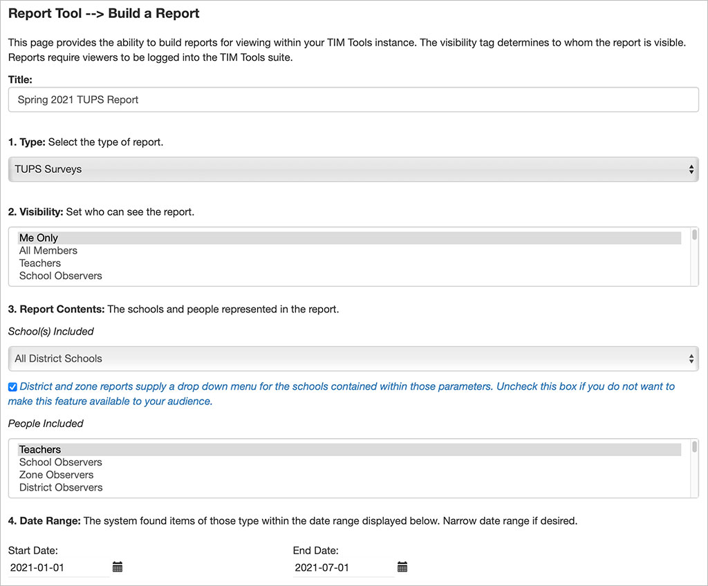
Sample settings for building a TUPS report.
View Your Report
From the “View a Report” menu, click on the name of the report you just created. You can view it online, but for our purposes, select the “Print Version” once you’ve opened the report, click the “Print Report” and then either send to a printer or save as a PDF so you can post it online for shared editing.
The First Read-Through
Now is the time to get out your colored pens, highlighters, and sticky note pads—whether analog or virtual.
Look at each section of the TUPS report separately. Since the first section is mainly demographic information, the following applies specifically to sections two through eight.
Which responses are consistent with your expectations? Highlight them in one color.
Which responses were unexpected? Highlight those in a different color.
Are there any “points of pride” that you can use as bragging rights about tech in your school or district? Note those. They may not contribute much to determining needs, but they can serve other purposes as explained in the post, Using TUPS Data: Individual Items.
Which is the most frequent response for each question? Where are the outliers? Can you explain the outliers?
Now it’s time to put on your detective hat and try to explain what you see in this section. Write a summary of the section results in two or three sentences. What are the common themes? What stories do the results tell? What are we doing well? What are the areas for improvement? Are there any recommendations that can be made right off the bat before you go into a more detailed analysis of each section? What are the unanswered questions that you need to follow up on using breakout data or the Excel template as an aid to interpretation?
When you’ve written your summary for one section go on to the next. As you work through the remaining sections, you may get additional clues to solve the unanswered questions raised by responses in earlier sections. Flip back and add those notes to what you already wrote in the earlier section.
As you work through subsequent sections, are you starting to find some common themes? What are those? Does each new section summary support what you’ve already written about earlier sections or does a later section challenge some of your earlier conclusions? Do those earlier conclusions need to be adjusted?
Bring the Team Together
 Hopefully, there’s been more than one person working through the TUPS report. Now is the time to bring the team together to compare notes. One person may have been looking at the report from a professional development perspective. Another might have more of a tech support perspective, and so on. Where did the team members come to similar conclusions? Where are there differences? How can the different interpretations be explained, resolved? What follow-up questions does the team want answers for? Are there any recommendations that can be implemented without further study?
This article was just about first impressions and insights available from reading a standard TUPS report. In later posts, we’ll break out individual sections and explore what the TUPS Excel template offers.
Index of TUPS Articles
- Using TUPS Collection Frameworks
- How often should we administer the TUPS?
- Using the TUPS to Target Professional Development
- Nail Your Next Tech PD with the Quadrant Graph
- Working with TUPS Data: The First Read-Through
- Using TUPS Data: Individual Items
- TUPS and Excel
- Find the Coaches Hiding in Your TUPS Data
Roy Winkelman is a 40+ year veteran teacher of students from every level kindergarten through graduate school. As the former Director of FCIT, he began the Center's focus on providing students with rich content collections from which to build their understanding. When not glued to his keyboard, Dr. Winkelman can usually be found puttering around his tomato garden in Pittsburgh.
Want To Know More?
Schedule a personal walk-through of the TIM Tools for yourself or your staff. See how this flexible set of technology integration tools will meet your school or district's specific needs.